GBD Architects Map
The GBD map served as my initiation into Product Design and design thinking. It unearthed my passion for design. This map remains a staple for GBD to this day, designed in alignment with GBD's brand identity and spotlighting their impact on the Portland, OR landscape.
ROLE
Product Designer
Project
GBD Architects
Tools
MapBox, Adobe XD, Adobe Photoshop, Adobe Illustrator
Date
Spring & Summer 2019

Background:
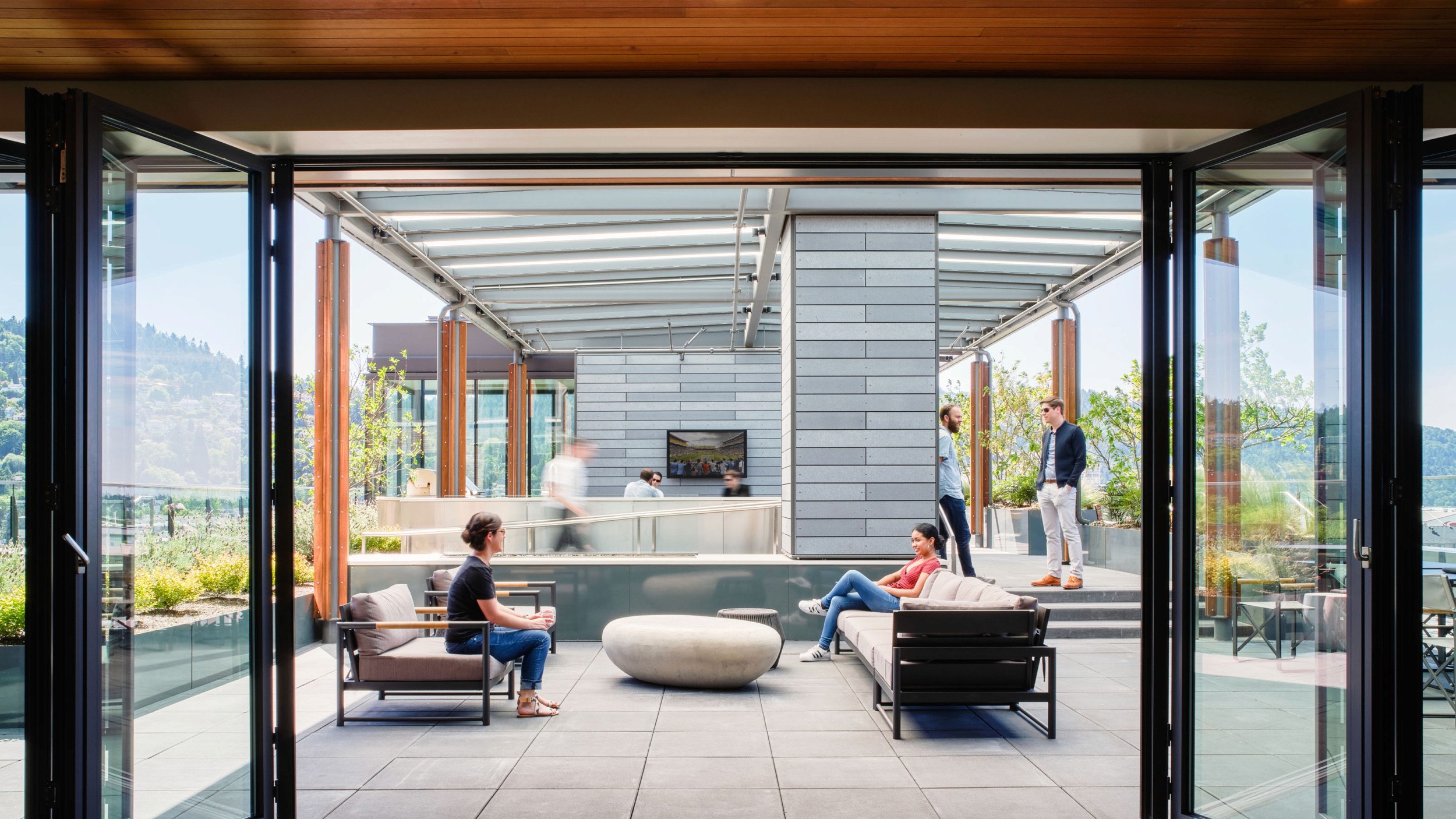
GBD Architects is a Portland based architecture firm. With over 200 projects across Portland, GBD is Portland's architecture firm and this map is meant to showcase their impact over that last 50 years.
Initial Thinking
Before this project, all GBD had was a screenshot of a map that linked to their location on Google Maps. Therefore, this project was made wow people with the amount of work GBD architects had done in Portland.
The Maps's Goals:
Make website more interactive to users.
Better represent GBD’s body of work in Portland.
Make finding projects easier.
Research Insights
Competitor Research:
Out of 5 similar firms, GBD was the only one not to have a interactive map.
Most competitors had a customized map that fit their design style.
New clients had a hard time getting a gauge of the impact GBD had on Portland's architecture.
Problem Statement
Challenge
How might we showcase and guide users through all the work GBD has done in Portland, while staying true to the GBD brand?
Design Concept
Visual Identity
An important part of creating this map was that it fit into the style and brand of GBD Architects. Therefore, through the project, I drew inspiration from their existing design system.

Design Iterations
Map Design:
For the map, I designed it on MapBox. This allowed me to control the colors of the map, the information shown at different zoom levels and create databases of where the GBD projects existed.

As seen above, I tried various color combos but ultimately designed a neutral and simple map that fit GBD’s minimalism.
Design Iterations
Pin Design:
The pin design was crucial to helping users identify the work GBD had done in Portland, it was important they stood out and were understandable at different zoom levels. These are the various iterations:
Differentiate GBD projects by service provided:
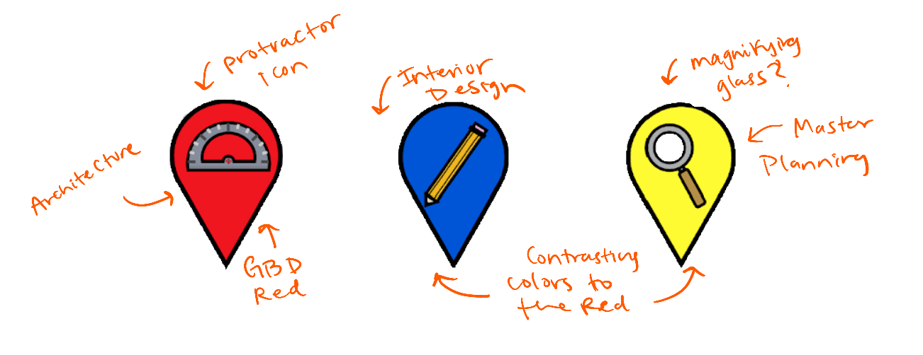
User testing found it was not easy to understand what each pin meant
Differentiate Architecture vs Interior design:
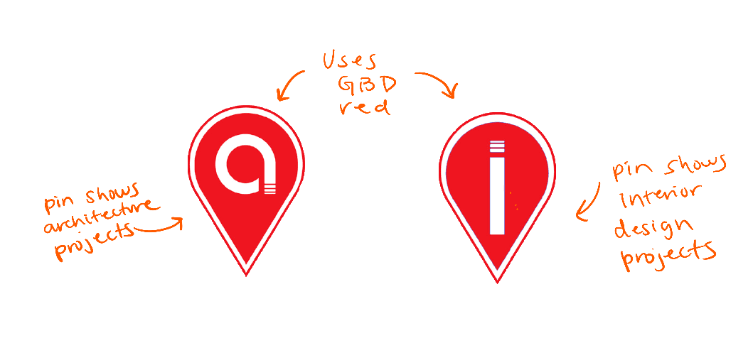
User testing found these pins were not easy to differentiate from a far away zoom
Showcase all the projects with the same pin and allow the user to click on each to learn more.
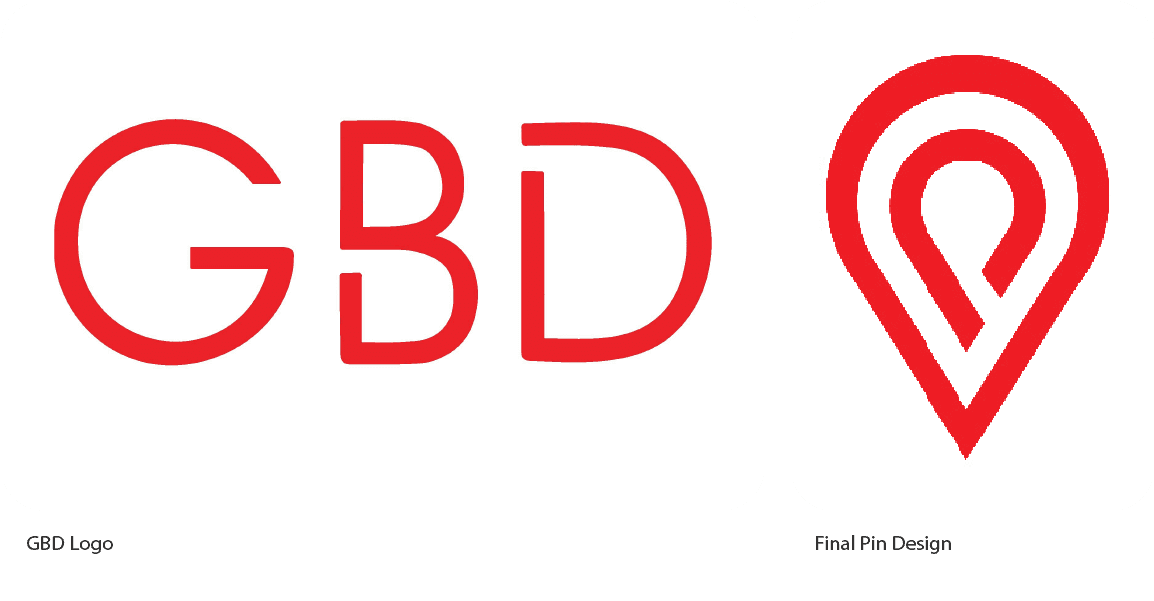
In the end, I choose to keep the pin the same for all projects. User-testing found it easy to identify and legible at all zoom levels. Additionally, the freeform pin design fit the freeform design of the GBD logo.
Map Filters:
Filters allow the user to more easily find the projects they are interested in. When designing the filters, I choose categories that pertain to information that already existed for projects. I also kept the design style similar to the overlay effect used as a description bar that already existed on the GBD website.
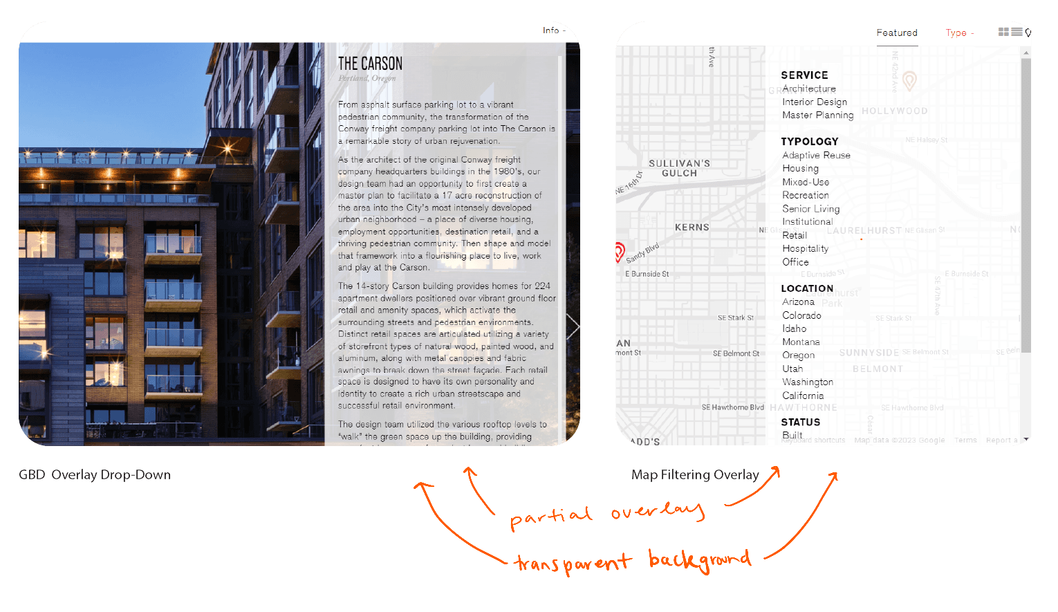
Map Pop-Up Design:
For the project pop-ups, I decided to again look into the GBD Brand Identity. I kept true to it by using the same colors, fonts and font sizes to display hierarchical information. The GBD website is largely composed of images therefore, I made the project take up most of the space and catch the user’s eye.

Final Design
GBD Live Map
Reflection
Takeaways:
This was a great experience to learn about Brand Identity and how to design components that don’t currently exist but still feel a part of the rest. I was also introduced to other design tools like:
Adobe Illustrator and Photoshop
Participating and learning from critiques
Iterating on feedback in a meaningful manner
You can check the map out below!